A PowerPoint template works when two things are true: it’s built properly underneath, and your team uses it the way it was built. Get both right and every deck looks like it came from the same company. Miss either and you’re back to five fonts, three versions of the logo, and a shade of blue nobody can name.
These PowerPoint template best practices come straight from the Hype studio. When a new client sends over the template they already have, usually built in-house or by a generalist designer, we see the same faults again and again. Below are the 12 checks we run, what each one means, and how to fix it. If you’d rather hand the whole job to specialists, that’s what our custom PowerPoint template design services are for.
Still deciding whether you need a template at all? Start with our PowerPoint template design guide, which covers what a template is, how slide masters work, and when a custom build pays off. This post is for teams who already have a template and want to know if it’s pulling its weight.
PowerPoint template best practices at a glance
Here are the PowerPoint template best practices we check, in brief. A well-built, well-used template passes all 12:
- Text uses the theme fonts
- Colour comes from the theme palette only
- Default text boxes and shapes match the placeholders
- Text settings and margins are consistent across placeholders
- Autofit is switched off
- There are enough layouts for your real content
- It passes the paste test
- Logos sit in placeholders, not behind the slide
- It’s accessible, with a set reading order
- It comes with assets and a short user guide
- Your team starts from layouts, not old decks
- Someone owns it, and there’s one version
The first 10 are about how the template is built. The last two are about how your team uses it.
PowerPoint template best practices for the build
A properly built template does the hard work, so your team doesn’t have to. These are the PowerPoint template best practices that in-house and generalist templates fail most often.
1. Text uses the theme fonts
Your brand fonts should be set as the theme’s heading and body fonts, not applied by hand. When they are, they sit at the top of PowerPoint’s font list and every placeholder picks them up automatically.
The giveaway that a template skips this: open the font list and the Theme Fonts section still shows Aptos or Calibri. That means every new text box starts life off-brand. Theme fonts live under Design > Variants > Fonts > Customize Fonts.
2. Colour comes from the theme palette only
The brand palette belongs in the theme colours, so it’s the first thing anyone sees when they open a colour picker. If the palette only lives in a brand guidelines PDF, people start copying hex codes by hand, and by the third deck the “brand blue” comes in four shades.
Check it by clicking any fill colour. The top rows should be your brand, in a sensible order, with tints and shades that still look like you. Theme colours live under Design > Variants > Colors > Customize Colors.
3. Default text boxes and shapes match the placeholders
This is the one almost everybody misses. The placeholders can be perfectly styled, but the moment someone draws a new text box or shape, PowerPoint falls back to its own defaults: 18pt black text, a stock blue shape, and the wrong margins.
A properly built template sets the default text box and default shape to match the brand, using right-click > Set as Default Text Box (or Set as Default Shape) and saving that into the template file. Every new element then starts on-brand, not just the ones in placeholders.
4. Text settings and margins are consistent across placeholders
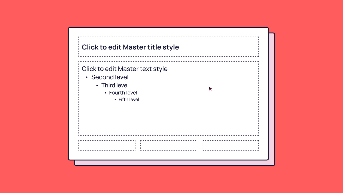
Every placeholder of the same type should behave the same way: same internal margins, same line spacing, same space before and after paragraphs, same bullet indents. In templates built without that discipline, a title sits a couple of millimetres lower on one layout than another, and the whole deck twitches as you click through it.
You won’t always spot it on one slide, but flick between layouts in slideshow mode and it shows up straight away.
5. Autofit is switched off
PowerPoint’s default is to shrink text until it fits the box. That’s handy for a one-off slide, but in a template it lets people squeeze a paragraph into a space designed for one line, at 9pt. We set placeholders to Do not Autofit (Format Shape > Text Options > Text Box), so layouts hold their shape and overflow is obvious.
This matters even more if your team uses AI. Microsoft’s own guidance says Copilot doesn’t change the font size or placeholder size when text needs more room, so placeholders need to be sized for real content from the start.
6. There are enough layouts for your real content
Too few layouts is the most common structural fault we see. If the template has a title slide, a bullet slide, and a blank, people build everything else by hand, and that’s where consistency goes.
A Hype template ships with around 20 layouts as a starting point, and we create more when a client’s content needs them. The number matters less than the coverage. Layouts should match the slides your team actually makes (agendas, case studies, data, team pages, quotes, timelines, section breaks), and every permutation should be thought through: two images, no image, chart plus commentary. Our design guide covers how to plan a layout library from scratch.
7. It passes the paste test
The paste test is a 10-second check for whether a template’s light and dark styles are set up properly. Copy a white text box from a dark slide and paste it onto a light slide. If the text turns dark and stays readable, the template passes. If you’re left with white text on a white slide, it doesn’t.
A template passes when text is coloured with the theme’s text colour rather than a fixed white, and the dark layouts are set up to swap that colour automatically. We build every Hype template this way, so content moves between light and dark slides without anyone reformatting it.
8. Logos sit in placeholders, not behind the slide
Most templates place the logo on the slide master or layout as a flat image. That works until someone needs a full-bleed photo or a chart that runs into the corner, and the logo is stuck at the back of the slide, impossible to move or work around.
We put logos and similar brand elements into placeholders instead. They still appear in the right place by default, but they behave like content, so other elements can sit over other placeholders when a layout calls for it. Most people don’t know this is possible, and it saves a lot of workarounds.
9. It’s accessible, with a set reading order
An accessible template helps everyone who receives your decks, including people using screen readers or navigating by keyboard. The essentials:
- A set reading order on every layout. Screen readers and the Tab key both move through a slide in this order, so the title should come first, then the content in a logical sequence. Check it under Review > Check Accessibility > Reading Order Pane.
- Enough contrast between the theme’s text and background colours.
- Alt text on any images built into the layouts.
Accessibility is usually an afterthought in templates built in-house. It’s far easier to build in at the start than to fix deck by deck.
10. It comes with assets and a short user guide
A template file on its own isn’t a toolkit. The best ones come with approved icons, image styles, chart styles, and any recurring graphics your team needs, so nobody ends up searching the internet for a close-enough icon at 11pm.
They also come with a short user guide, and short is the point. A 60-page manual doesn’t get read. A few pages showing which layout to use for what, plus the handful of rules that keep decks on-brand, does.
PowerPoint template best practices for everyday use
Even a well-built template needs good habits around it. These two PowerPoint template best practices are about the team, not the file.
11. Your team starts from layouts, not old decks
The quickest way to undo a good template is to build every new deck by copying slides from an old one. Old slides carry their old formatting with them, and after a few rounds of copy and paste, nobody knows what’s on-brand any more.
Three habits keep things clean:
- Add slides from layouts. Use Home > New Slide and pick a layout, rather than duplicating last quarter’s slide.
- Paste into the current theme. When bringing slides in from another deck, choose Use Destination Theme so they adopt the template.
- Reset slides that have drifted. Select the slide and click Home > Reset to snap placeholders back to the layout.
12. Someone owns it, and there’s one version
Every template needs an owner: someone who answers questions, approves new layouts, and releases updates when the brand changes. Without one, the template splinters into local copies saved on desktops and shared drives, each a little different from the last.
For Microsoft 365 teams, the neatest fix is a SharePoint organisation asset library. Templates stored there appear directly in PowerPoint when people create a new presentation, so everyone starts from the current version without hunting for it.
Is your PowerPoint template ready for Copilot and Claude?
AI tools can now build presentations straight from your template, but only if the template is built for them. That makes AI readiness the newest of the PowerPoint template best practices, and the one most templates haven’t caught up with.
Microsoft’s current guidance for Copilot in PowerPoint says it learns mainly from a template’s sample slides, not its slide master. It only falls back on the slide master when there aren’t enough sample slides, which is when output starts to look generic. Microsoft recommends sample slides that reflect how your organisation presents content, at light, medium, and heavy text densities, and templates built in desktop PowerPoint for Windows or Mac rather than PowerPoint for the web.
Organisations with Copilot licences can also store templates, colours, fonts, and brand guidelines in an official Brand Kit, managed by named brand managers. Its Brand Reviewer flags off-brand colours, fonts, and logos in a deck. It’s a useful safety net, but it can only check against what the template defines, so the build checks above still come first.
At Hype we work human first: our designers do the thinking, the creative, and the build. For templates, that means human first, AI ready: built by people, and set up so your team’s AI tools can use it if you want them to. AI setup isn’t part of every template, because not every team needs it. At the start of a project we ask how your team builds decks, and if you’re using Copilot or Claude to create presentations, we build the template so those tools can use it properly.
Training can’t fix a template that’s built wrong
The PowerPoint template best practices above split into two jobs. Habits are your team’s job, and a short training session plus a clear owner covers most of it. The build is the template’s job, and no amount of training fixes a template with the wrong default text box, no reading order, or eight layouts for a team that needs 20.
So run the checks. If your template passes the paste test, uses theme fonts and colours throughout, and has a layout for every slide your team makes, it’s doing its job. If it fails several, a rebuild will usually cost less than another year of workarounds. Our guide to creating a custom PowerPoint template explains what that involves, and you can see a finished example in our professional services PowerPoint template case study.
Want a template that passes all 12 checks from the day it lands? See what a custom Hype template costs and what comes with it.
FAQs
What are the most important PowerPoint template best practices?
The most important PowerPoint template best practices are building on theme fonts and theme colours, setting default text boxes and shapes to match the brand, switching off autofit, and including enough layouts for the slides your team actually makes. On the usage side, the big two are starting new slides from layouts rather than old decks, and having one owner and one current version.
How do I stop my team going off-brand in PowerPoint?
Make the on-brand choice the easiest one. That means theme fonts, theme colours, matching default text boxes and shapes, and a layout for every common slide type. Then add a short user guide, a named template owner, and a single current version stored where everyone creates new decks, such as a SharePoint organisation asset library.
Why does white text disappear when I paste it onto a light slide?
Because the text was set to a fixed white rather than the theme’s text colour. In a properly built template, text follows the theme and inverts automatically between dark and light slides. We call this the paste test, and it’s one of the quickest ways to check how well a template is built.
Should autofit be turned off in a PowerPoint template?
In most template placeholders, yes. Autofit shrinks text to squeeze it into a box, which breaks the type hierarchy and hides overflow. Setting placeholders to Do not Autofit keeps layouts consistent and makes it obvious when a slide has too much on it.
Can Copilot create presentations from our PowerPoint template?
Yes, if the template is built for it. Copilot in PowerPoint relies mainly on a template’s sample slides and only falls back on the slide master when there aren’t enough of them. Hype can build templates with that in mind for teams using Copilot or Claude.
How often should we review our PowerPoint template?
Whenever the brand changes, and at least once a year otherwise. A review should look at recent decks for recurring workarounds, because a slide type your team keeps building by hand is usually a missing layout.